Relative Strength Index with AlertsRSI with alert on enter and exit overbough and oversold area.
You can change the overbough and oversold levels as well.
Cerca negli script per "relative strength"

Relative Strength Index [C. Brown]Inserted are the EMA and SMA that are used by C. Brown along with highlighted S/R zones on the RSI for ease of access.
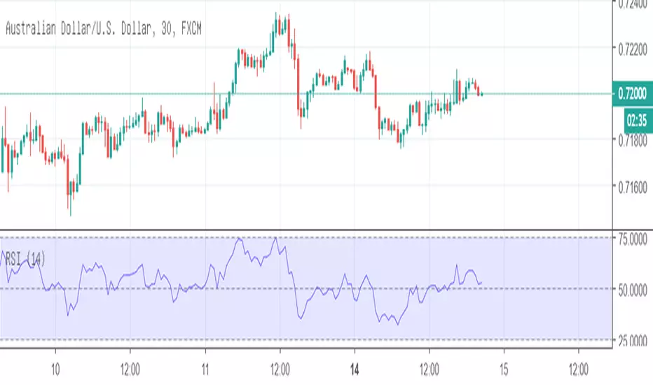
Relative Strength Index - JDRThis is the basic RSI, with more levels. The 80, 50 & 20 levels has been added. When the RSI is above the 50 level, it can be considered to be a uptrend. When the RSI is below the 50 level, it can be considered to be in a downtrend. However this is just an indication, price action is the best way to determine whether price is in an uptrend or downtrend.

Relative Strength Index custom lines and fillingI changed this RSI oscillator to give everyone ability to change position of strategic lines as RSI has a lot more to offer than only overbought and oversold boundries. You can change overbought and oversold line and make one more space depend what you are looking for. For me and as default it is 40-60 range. I put a center line at 50.

ALMA RSIRelative Strength Index indicator which uses Arnaud Legoux Moving Average inside instead of Wilder's Exponential Moving Average (RMA).
This makes it more reactive and also smoother without less false positive signals. It is much easier to find divergences this way.

[LunaOwl] 智慧型RSI (Smart RSI - a handy tool with less noise)Relative Strength Index is a common technical analysis tool, it is classified as a momentum oscillator, measuring the velocity and magnitude of directional price movements. it is most typically used on a 14-period timeframe, measured on a scale from 0 to 100, with high and low levels marked at 70 and 30.
相對強弱指標是常見的技術分析工具,它被歸類為動量振盪器,用於測量定向價格運動的速度和幅度,通常會使用14期數,擺盪範圍在0到100間,超買超賣分別標記成70、30。
after simple improvement and addition of logical judgment, it becomes a passive judge from subjective judgments, avoid the shortcomings of peoples in watching passivation, and the trade can be more consistent.
經過簡單的改良與添加邏輯判斷,能夠使RSI指標的使用,從主觀的判斷成為被動的確認指標,有效避免人們判斷指標鈍化的主觀缺失,並能夠使得交易更加一致。
--------------------------*
1) parameter
RSI period 1 - default is 14, same as general RSI.
RSI period 2 - default is 5, due to its own formula, the amplitude of the oscillator will become larger and more agile or fast. When the parameter is small.
exponential moving avg of RSI - using the result of RSI period 1 as the source of Ema's formula, the default length is 14, which can filter the excessive agility of RSI period 2 to reduce noise, and compared to using the baseline as the criterion for long and short judgments, The characteristics of exponential moving avg are more suitable to become flexible filtering standards.
Overbought - default is 70, you can set your overbought level.
Oversold - same as above, the default is 30.
2) Options
Open Candle color(開啟蠟燭線趨勢) - choose whether to start the color of the candle.
Open background color(開啟指標背景色) - the default is false, you can turn on.
--------------------------*
1. 設置參數
RSI期數1:預設值是14,是普通的RSI指標。
RSI期數2:預設值是5,由於RSI公式的算法,造成參數愈小擺盪幅度就會變大,反應比較快。
指數平均化的RSI期數1:將RSI期數1的結果帶入指數移動平均公式,預設值14,它能過濾RSI期數2過度敏捷的缺點,減少雜訊,相較於單純使用基準線作為多空判斷標準,用EMA的判斷標準更加因時制宜。
超買線:預設值是70,可以隨意調。
超賣線:預設值是30,一樣的。
2. 設定選項
開啟蠟燭線趨勢:顧名思義。已經幫您開好了。
開啟指標背景色:顏色太淺的話可以調深一點。
--------------------------*
ver.2- adjust new style design and create two options.
修改2: 調整新的樣式設計與建立兩個選項。
--------------------------*
ver.3- Create alert condition. maybe I should refer to the Alert Creation Framework,
there is also room for improvement.
修改3: 建立快訊選項。我應該參考警報創建框架,還有進步空間。
--------------------------*
Indicator Style - 指標樣式
The design uses casual light color style, light gray between overbought and oversold.
--------------------------*
Market Example - 市場範例
1. Bitcoin/Tether, Binance, 1 day
2. Bitcoin/USD, Coinbase, 4 hour
3. EUR/USD, Forex Market, 4 hour
4. GBP/USD, Forex Market, 30 min
5. TAIEX, Taiwan SE Weighted Index, 1 week
--------------------------*
postscript - 後記感想
The purpose of publishing Chinese Scripts is to make Pine close to more Chinese user.
I hope English skills enhancement...staggered writing makes me feel hard.
發布中文腳本的目的,是希望可以讓 Pine 親近更多中文圈的使用者。希望我的英語進步,中英文交錯撰寫有一些困難。
--------------------------*
If you find my works useful, you can give me encouragement. I can buy more books to sophisticated themselves.
如果您發現我的作品有用,可以給我鼓勵。讓我可以買更多書籍來精進自己。

Relative Strength Index with Highlights and Success TestThis script does two things:
1- Highlights extreme levels on RSI
2- Calculates what % of the time, price closed higher (lower) with some minimum threshold when RSI was below oversold (overbought) level in a predefined number of bars.
I use this to understand if buying the dip/selling the rip works for a security and on what time frame and if it could be a profitable strategy that can generate large enough moves.
No guarantees on the accuracy of the code. Let me know if you see anything wrong
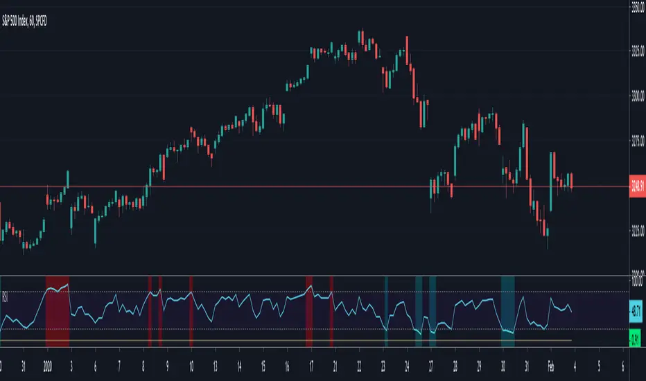
Relative Strength Index with HighlightsThis script highlights the indicator background when the RSI exceeds oversold and overbought thresholds making it easier to spot them.
Good for strategies that rely on extreme RSI readings

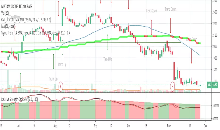
Relative Strength Index With EMA and Control ZonesThought this could be helpful since I couldnt find an RSI with an ema and Browns theory using control zones. Hope you all enjoy!

RSI with Overpriced and Underpriced highlightRelative Strength Index (RSI) with Overpriced and Underpriced highlights, respectively set at 70% and 30%

Relative Strength Index+emastandart rsi with 55 days ema
it works well for all time frames to enter and exit
u can set alerts according to this
for examle rsi crossing up ema
rsi crossing under ema

Relative Strength v JPYThis script shows the percentage difference of price from the 200 day moving averages of various JPY pairs.

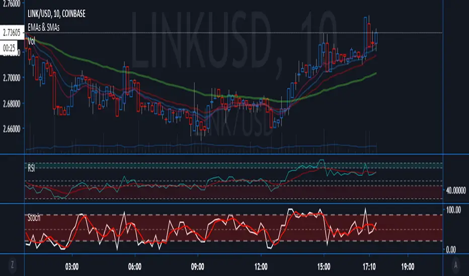
RSI with StochRSI CrossesRelative strength index plotted with arrow up/down to indicate StochRSI crossovers.
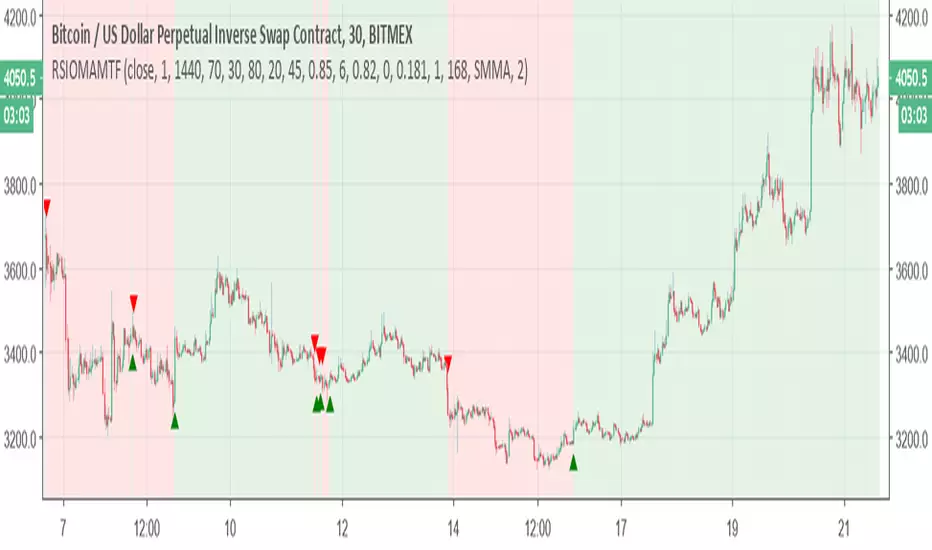
Relative Strength Index of Moving Average MTF alertsAll credit to this study is for chris jhoncic , this is MTF version with alert of his study
basic idea is hybrid of RSI and different MA
You can choose which MA from the following list:
Tillson Moving Average (T3)
Double Exponential Moving Average ( DEMA )
Arnaud Legoux Moving Average ( ALMA )
Least Squares Moving Average ( LSMA )
Simple Moving Average ( SMA )
Exponential Moving Average ( EMA )
Weighted Moving Average ( WMA )
Smoothed Moving Average ( SMMA )
Triple Exponential Moving Average ( TEMA )
Hull Moving Average ( HMA )
Adaptive moving average (AMA)
Fractal Adaptive Moving Average (FAMA)
Variable Index Dynamic Average ( VIDYA )
Triangular Moving Average (TRIMA)
to change the time frame change int2 to what you desire
Relative Strength OscillatorTracks an EMA and SMA of the 14 day RSI. Also avoids the market with 14 day RSI is above 90.
Buy when green, sell when red.
Relative Strength Index with Averageadds an avg input to smooth the RSI. Helps with determining tend-direction at a glance

Relative Strength Index Line 50The only variant to the original is that it has the average line of 50.